George’s Brew Beer Designs
November 5, 2009
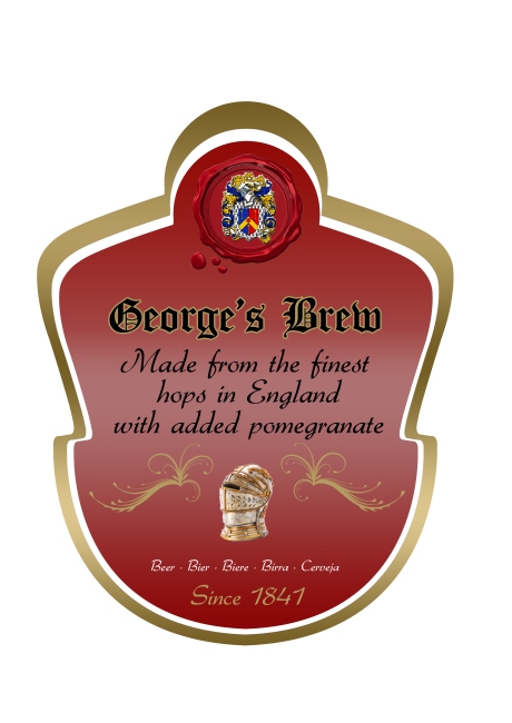
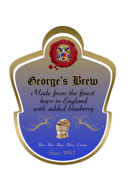
These are other experimentations of beer labels me and my partner Christian Costa tackled in the brief. This time we have gone for an English Old fashion look with unusual fruits that will be added. We experimented more with the label this time and I think it paid off because the shape adds to the effect.


Caliente Beer designs
November 5, 2009
These designs are from a brief we had to tackle by using a beer and an unusual flavour mixed in. Me and my partner Christian Costa came up with this ingredient of chili to put in the beer. After much experimentation we came up with this Mexican theme using elements of cactus and deserts. We also followed the method of using the Nandos style of naming different temperatures of their chicken to show the different temperatures of how hot the chili was in the beer. We also colour coded the beers which will help the viewer understand the temperature and flavour difference. We used spanish words such as suave, and fuego as names of temperatures to give it more of a exotic feel. The flavours we chose were Original, Lemon & herb, Suave (medium), Fuego (hot), Extra hot, and Chocolate. We got the layout idea from Magners beer. We thought it would be a good approach to tackle the beer label because Magners is a successful company.


Driving while on a mobile phone concept
November 5, 2009
These are three billboard posters I have designed for my awareness campaign against driving while on a mobile phone. I have produced three to show that my idea works. I have used three images of a woman, man, and a little boy who are all members of a family. The idea behind these posters is to produce big shocking but also sad imagery with a strong title that rhymes that will help you remember the advert.
This is a storyboard I created for an awareness campaign against the dangers of using a mobile while driving. I thought of not using drink driving because it has been over done and the shock tactics for this are not as scary as they used to be. This storyboard is for a TV advert and it will consist of a paragraph in the centre of the black screen throughout. It is silent so it will really get the viewers attention as the sentences slowly develops into a paragraph. The clever part about this storyboard is the sentences makes sense throughout. The last screen with the paragraph complete has the sound of a car crashing. The final screen has a voice over saying “Think…Don’t use your mobile while driving.”
Illusions
October 25, 2009
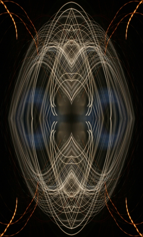
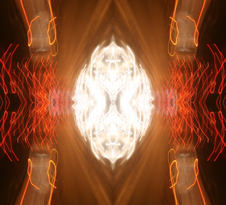
This are some experiments of illusions I created for a side project of mine. They were originally slow exposure photographs of cars on the motorway at night. I zoomed and cropped sections I found interesting and duplicated them and the results are what you see below.


